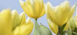
The time to bloom has come.
Spring smells of flowers, feels like a light warm wind, gives a feeling of a fresh start and boundless possibilities and hopes. This feeling is transmitted to everyone – designers create bold bright collections, at the same time not devoid of grace and tenderness, artists paint odes to spring and the nascent life.
We suggest keeping up with the spring trends.
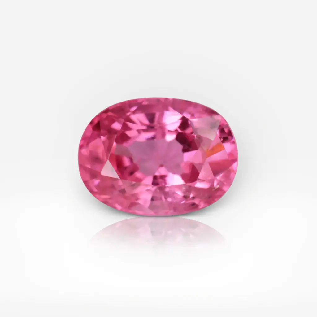
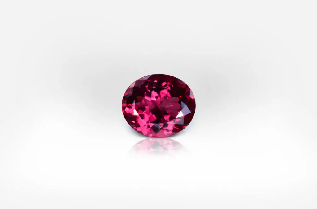
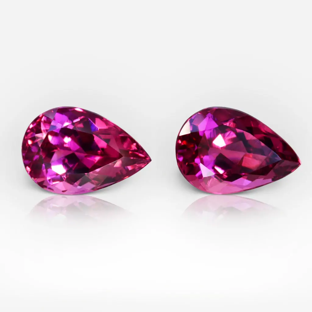
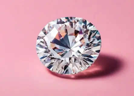
Bubblegum
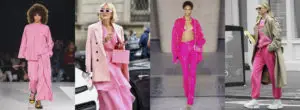
This bold and at the same time childish shade of pink seems to remind of bubble gum. It is undeniably fun – and holds a lot of power. This eye-catching color sends a message of positivity and playfulness.
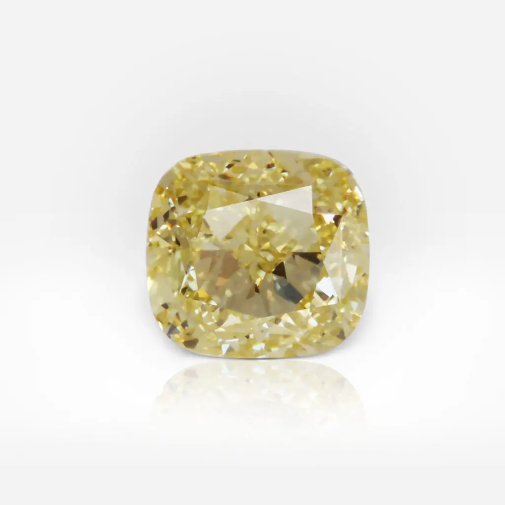
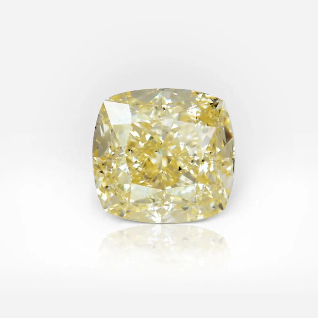
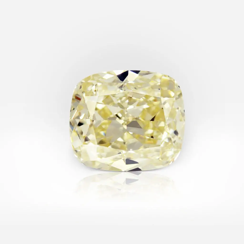
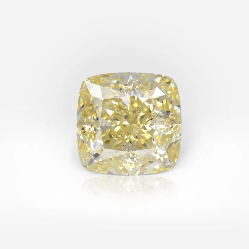
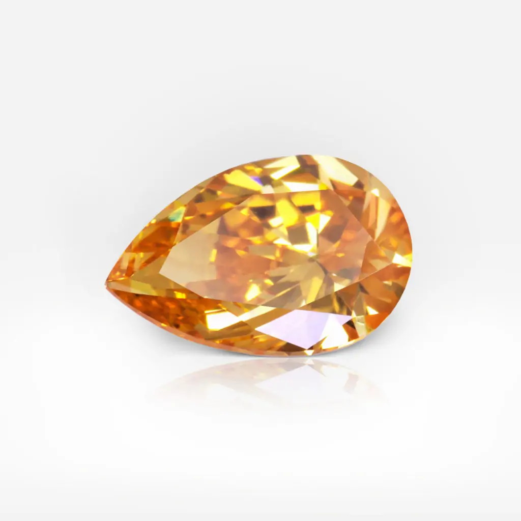
Popcorn yellow

Popcorn Yellow looks like melted butter or the first irises. This shade is definitely worth paying attention to. It is definitely not as bold and bright as its predecessor – but more gentle and subtle.
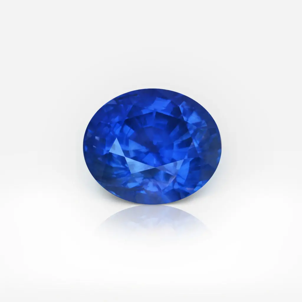
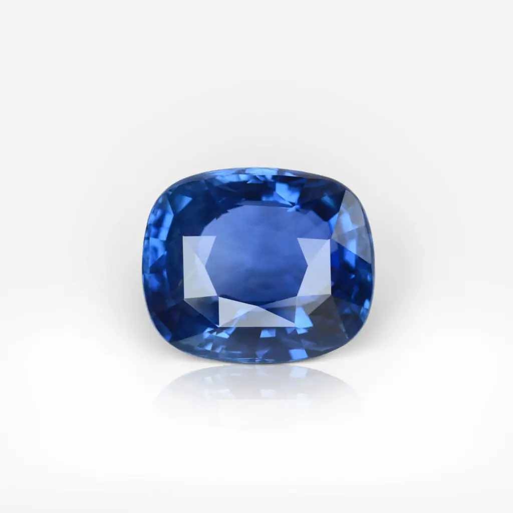
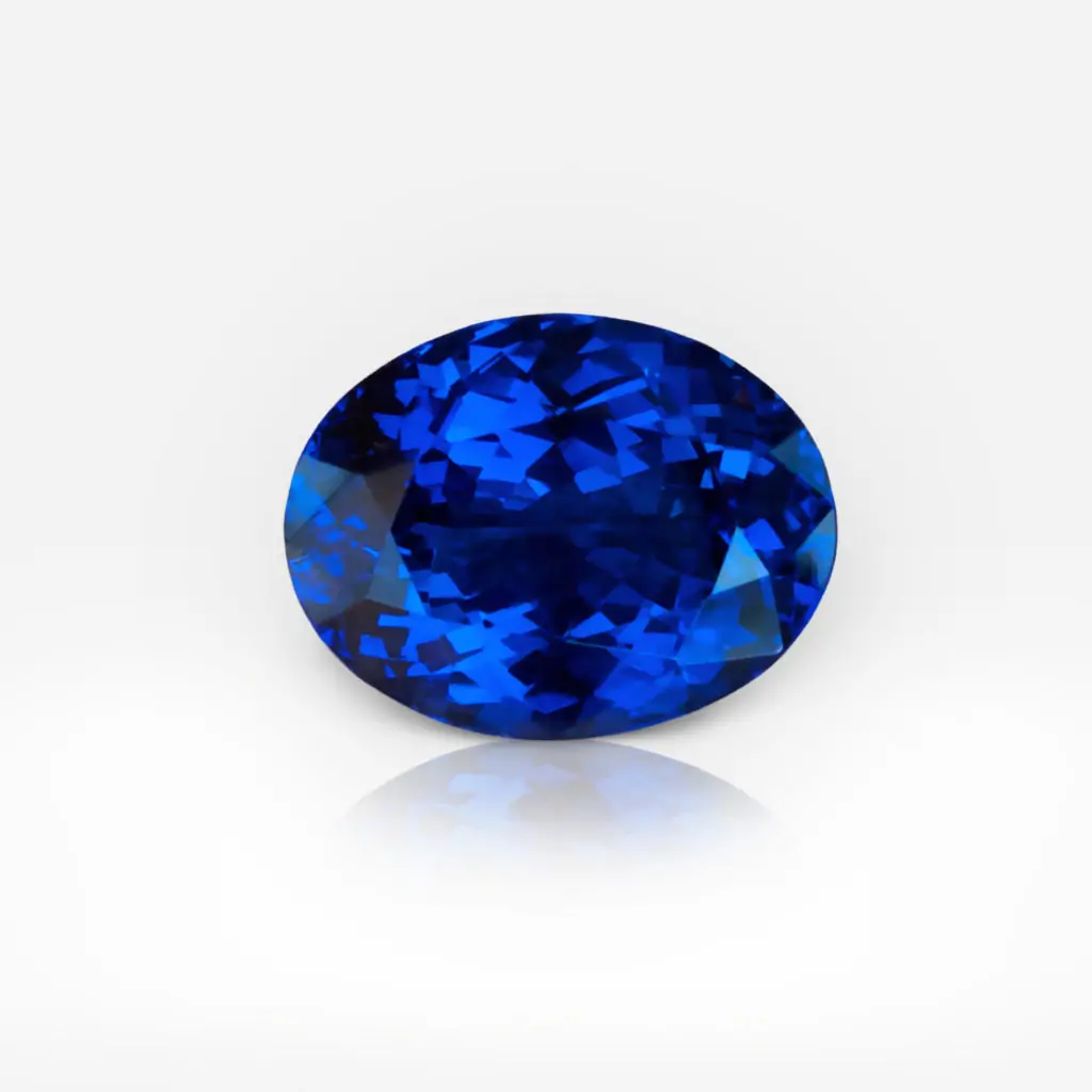
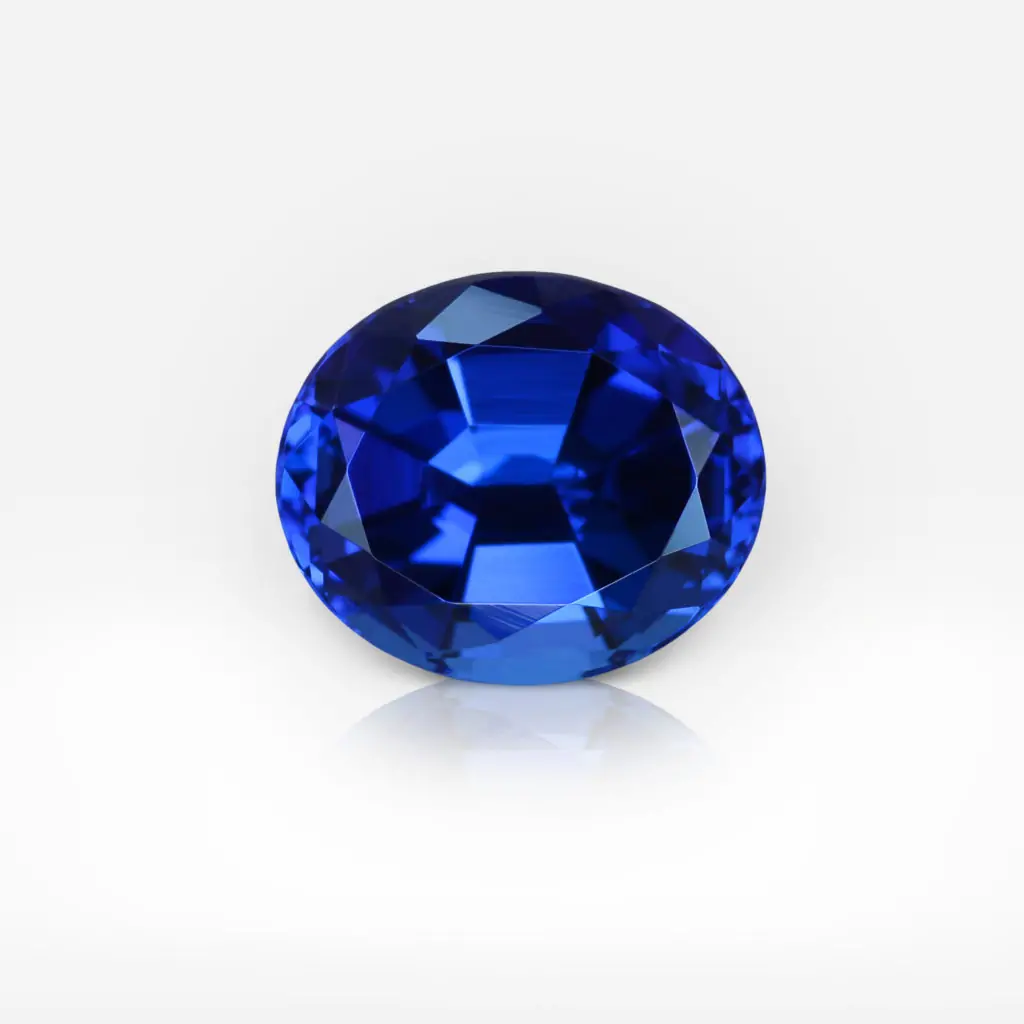
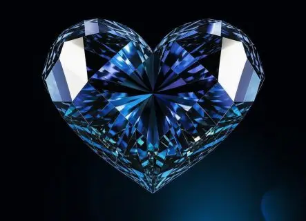
Brady blue
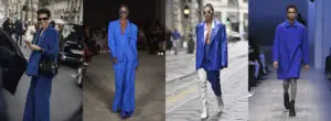
Timeless color that gives serenity and a sense of freedom. Balenciaga, Nina Ricci and Stella McCartney demonstrated Cerulean color in their spring/summer 2022 collections.
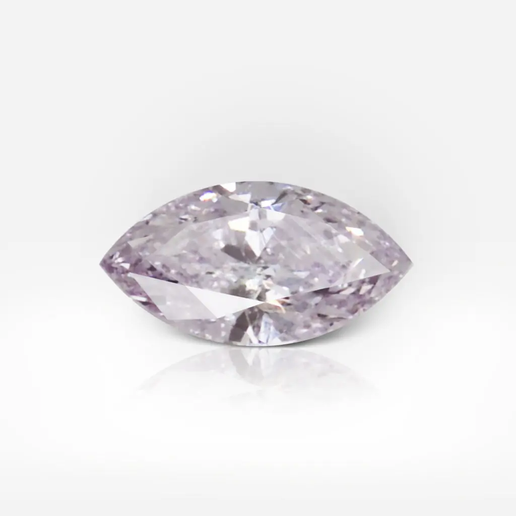
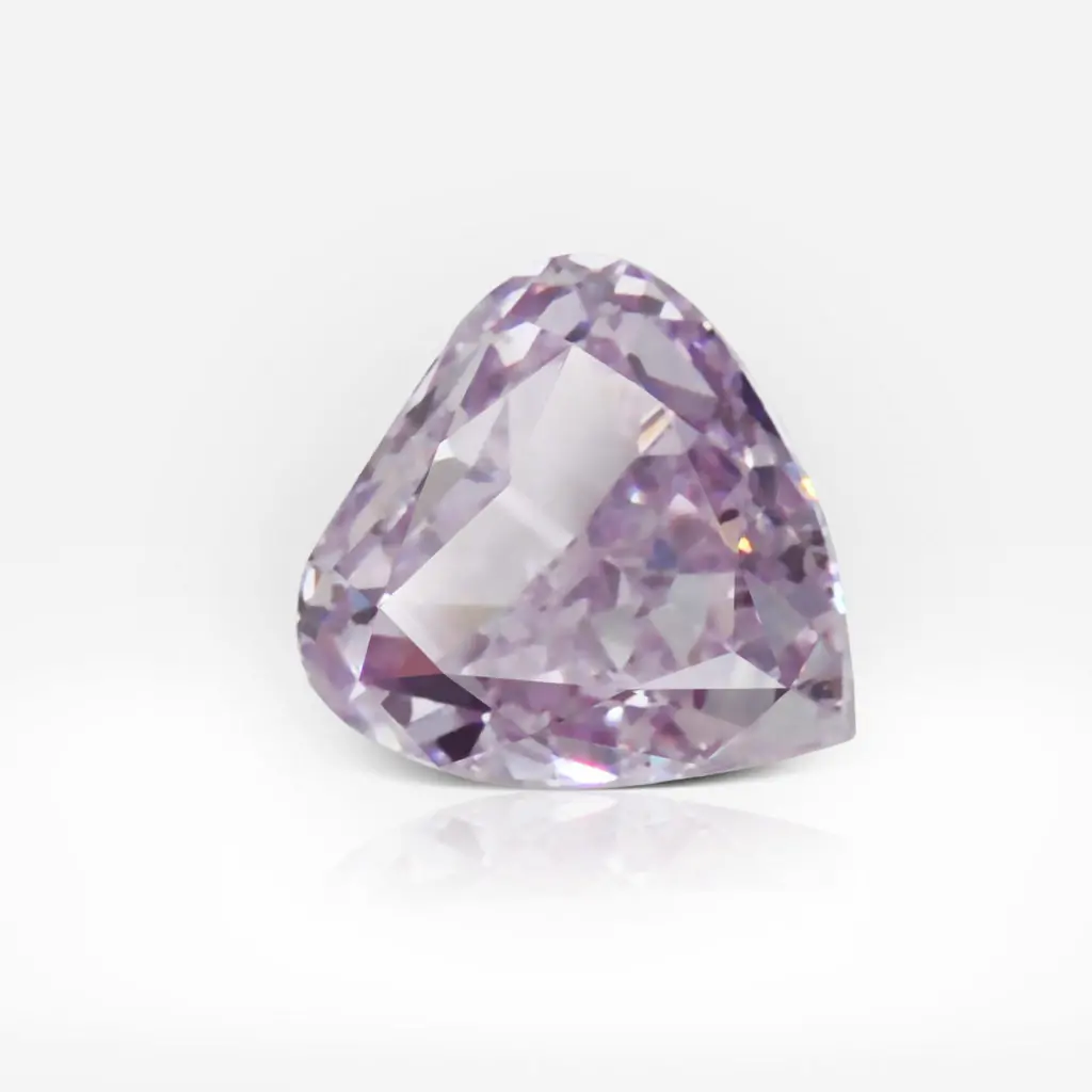
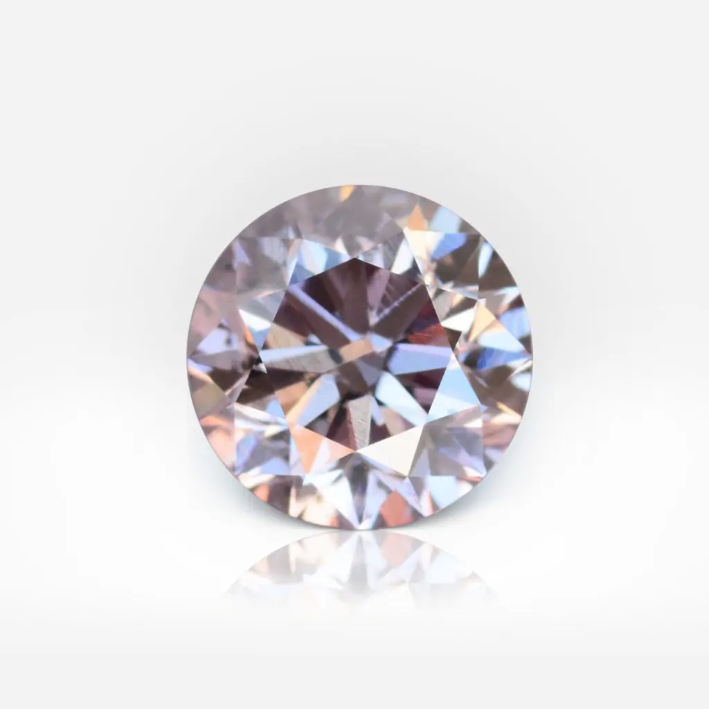
Orchid bloom
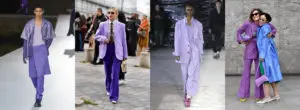
Different shades of purple are here to stay – at least for a year. However, in the gentle spring, it’s worth taking a closer look at Orchid Bloom. This light tint resembles delicate petals of early spring flowers that are full of freshness.
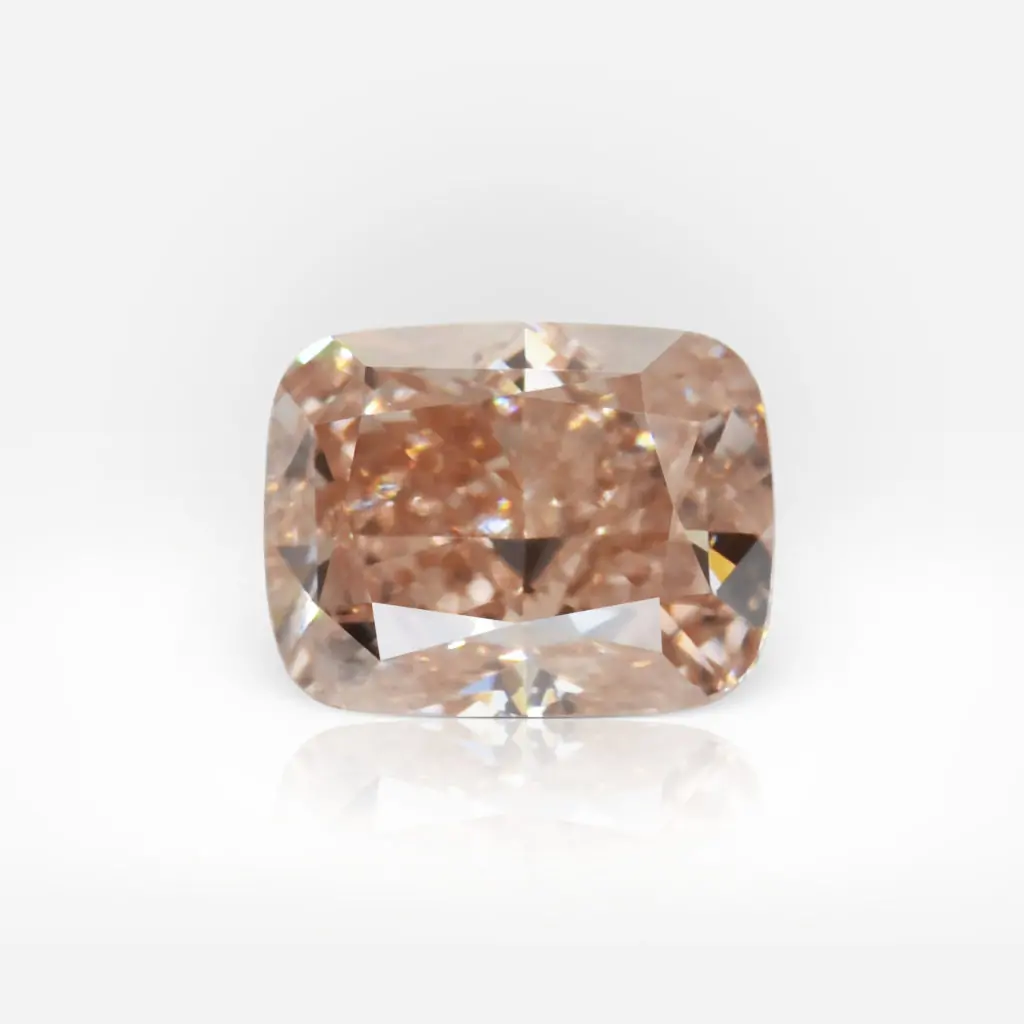
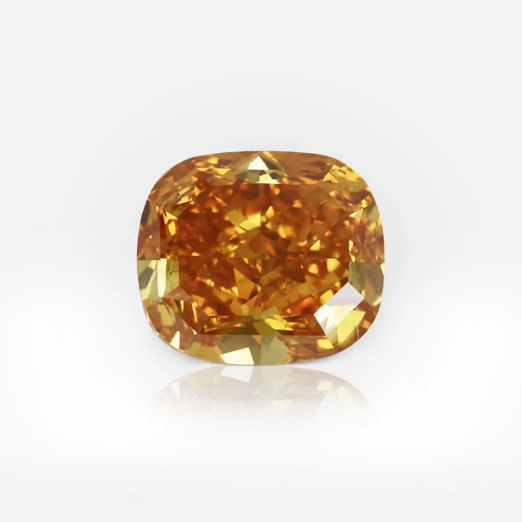
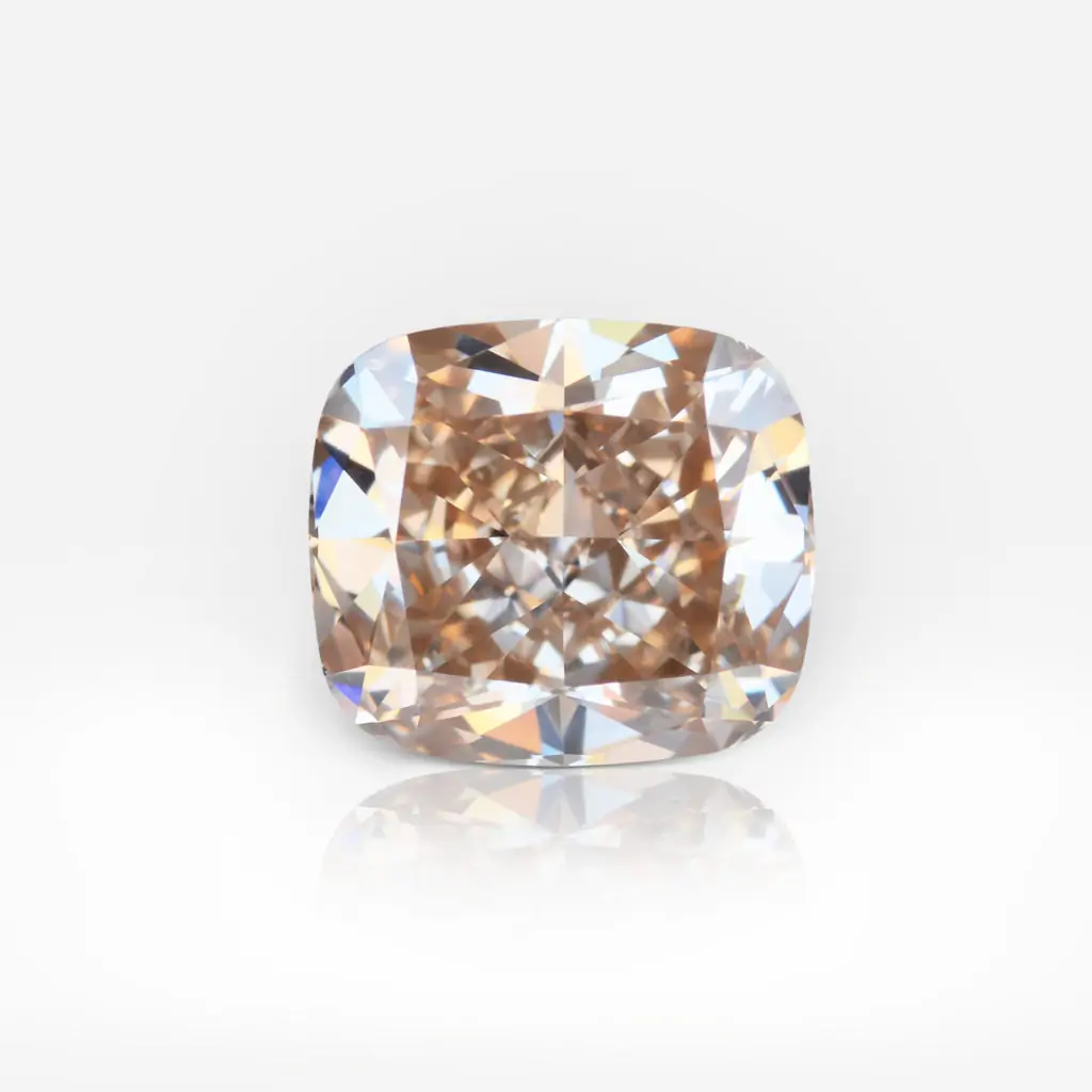
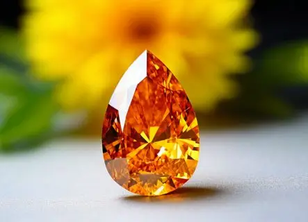
Coral rose
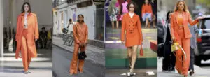
Do not confuse this shade with orange! Coral rose is more gentle, and elusive. It reminds of blooming gardens, tea parties in the shade of trees, timid sunsets and peaches.
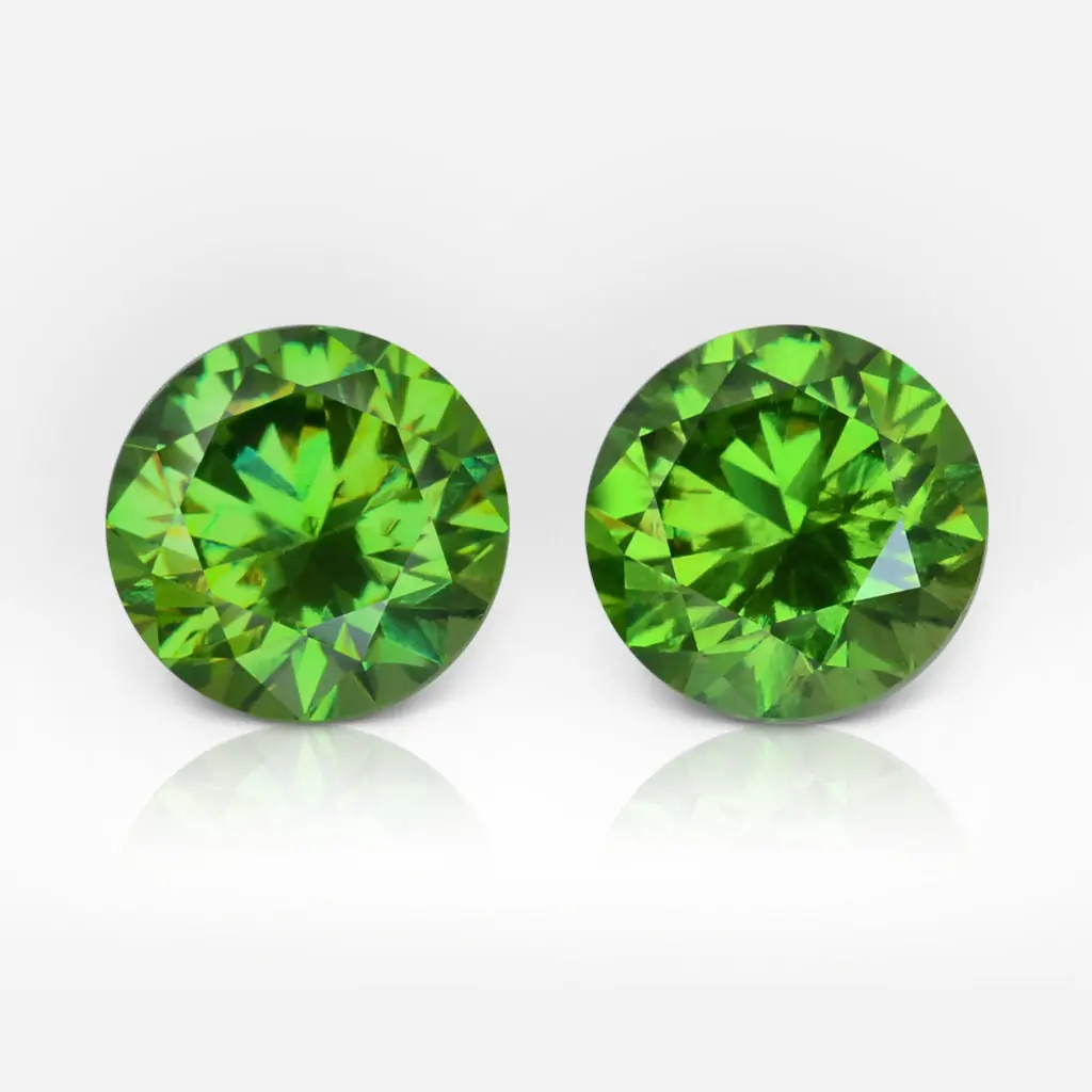
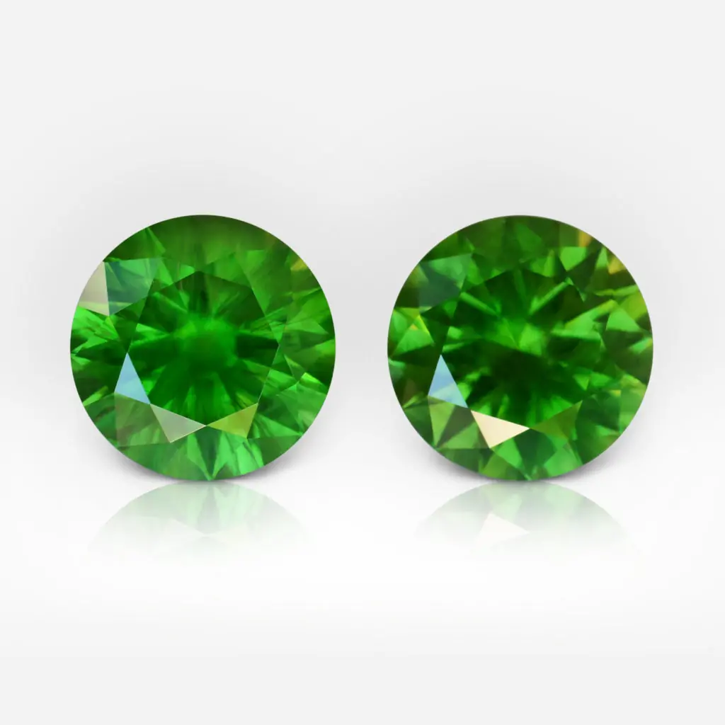
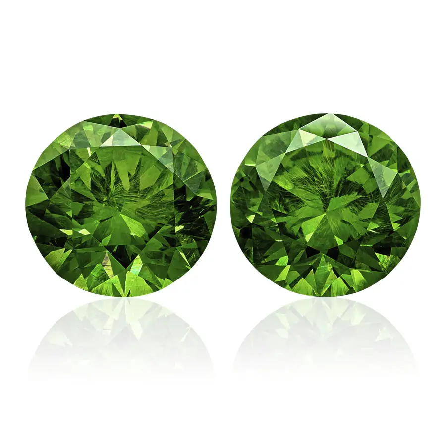
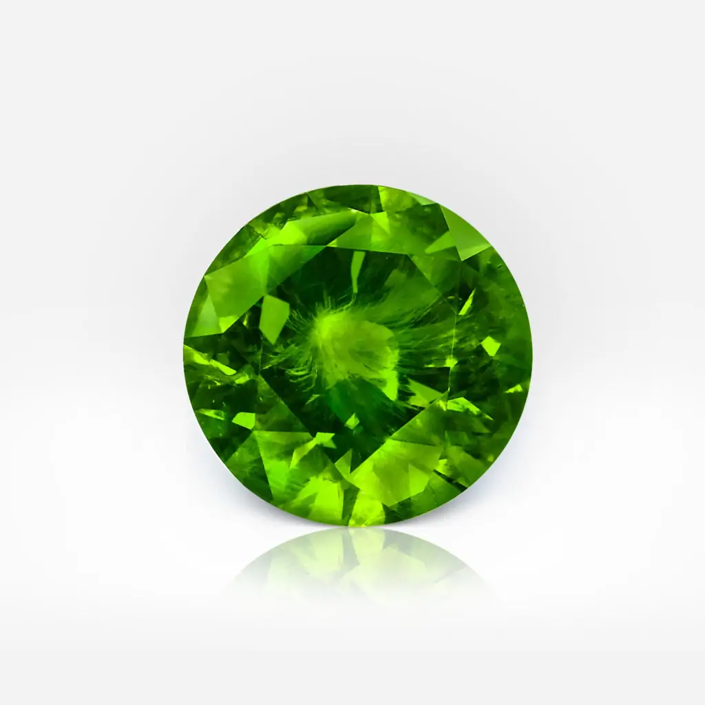
Greenery
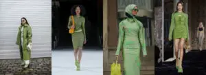
Green has been in vogue for several seasons. However, Greenery shade is truly special – it is bold, rich and playful! It symbolizes the beginning of a time of experimentation, risk and new horizons.
Subscribe to discover the world of diamonds and gems. If you have any questions, please let us know.


